Redesigning the wallet, the most-visited page
company:
Ben
roles:
LEAD, interaction & Content design, USer Research
YEAR:
January 2025
Overview
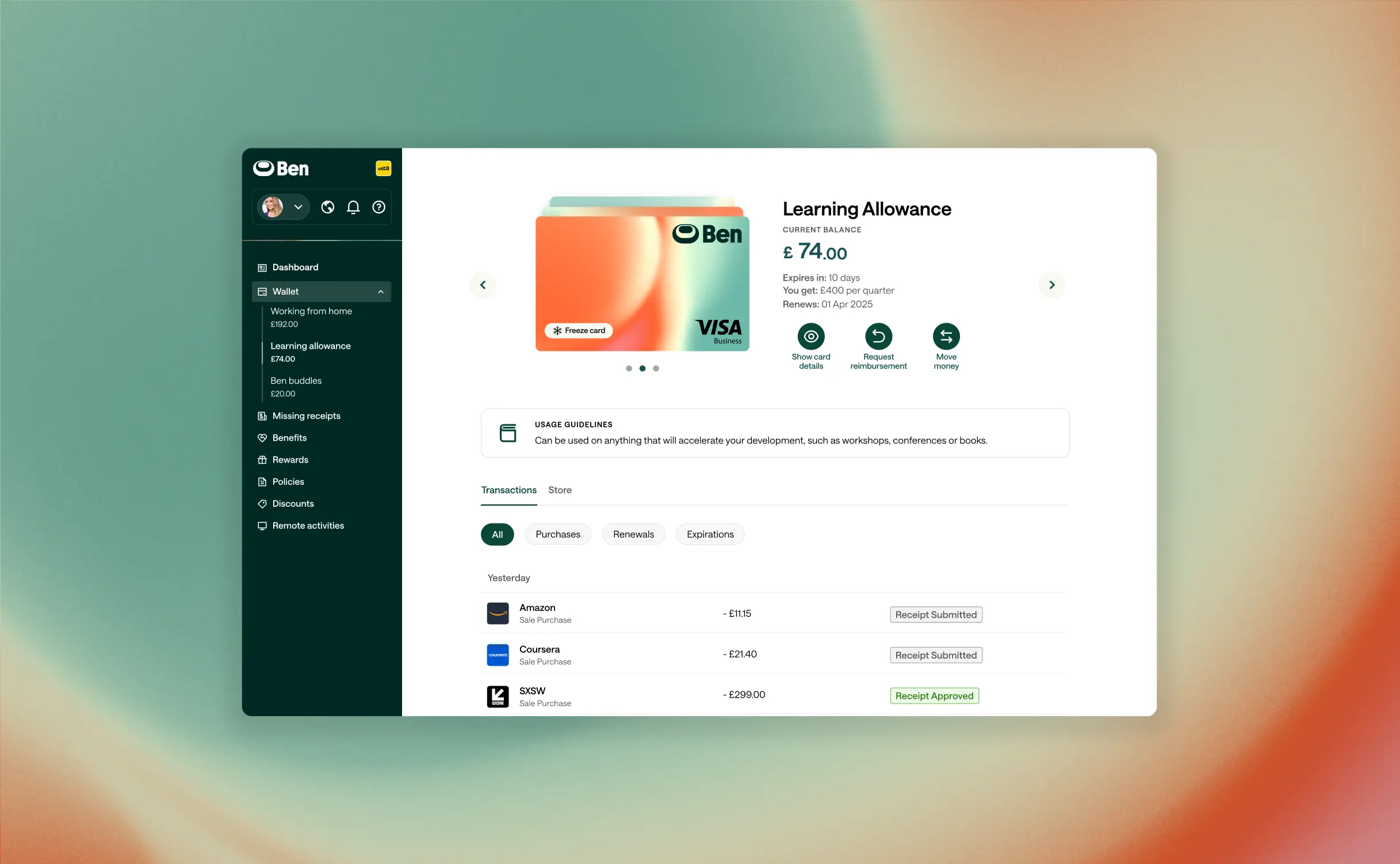
I led the redesign of the wallet page, the product’s most visited page, resulting in a 29% reduction in findability time for key actions. Usability tests also showed a 17% increase in content comprehension compared to the baseline design.
"I really love this, much cleaner UX, summary of the key info an employee would need, both content you want to push. Great job!" - Zalando rewards manager
Reducing findability time of key actions
Problem
Research and testing revealed that users primarily
visit the wallet page to check card balances and view transactions. However, users averaged 32 seconds to discover all key actions due to hiearchy issues; options were scattered across the page and some buried below the fold.
The transactions list required an extra click to access, forcing users to navigate deeper for information they expected to find upfront.
visit the wallet page to check card balances and view transactions. However, users averaged 32 seconds to discover all key actions due to hiearchy issues; options were scattered across the page and some buried below the fold.
The transactions list required an extra click to access, forcing users to navigate deeper for information they expected to find upfront.

Before
Process & Solution
I repositioned the main actions above the fold and brought the transactions list directly into view, eliminating the need for users to jump between two pages to access their transaction history. User testing showed a reduction of 29% in findability time.

After
Improving readability of card details

Before
Problem
Displaying card details over the card created readability issues. Since companies can whitelabel and upload custom card artwork, the details often had poor contrast against the background, making them difficult to read.
After
Process & Solution
To resolve this, I moved card details to a separate modal. I also added 'copy' buttons next to each field, streamlining the process of copying card details. Additionally, I created a set of guidelines for the creation of card artworks.
The new design lets companies showcase their brand on the card while ensuring accessibility.
The new design lets companies showcase their brand on the card while ensuring accessibility.
Reducing support queries by improving content clarity
Problem
The support team often received questions about card allowances: customers struggled with understanding expiration dates, renewal timings, and rollover amounts.
I analysed over 395 Intercom support queries to get a sense of what users were getting confused with. Additionally, I conducted comprehension tests to further identify the underlying issues.
I analysed over 395 Intercom support queries to get a sense of what users were getting confused with. Additionally, I conducted comprehension tests to further identify the underlying issues.

The old explanation that was generating confusion
Process & Solution
After developing a series of alternatives, I conducted an A/B test with three different copy variants, each with different explanations.
The variant that achieved the highest comprehension score (with 88% of users answering correctly) was rolled out. The new design showed a 17% increase in content comprehension scores compared to the baseline.
The variant that achieved the highest comprehension score (with 88% of users answering correctly) was rolled out. The new design showed a 17% increase in content comprehension scores compared to the baseline.

A question from the content comprehension test, alongside the variant that was tested and performed best
Addressing usability issues on the mobile app
Problem
Users were submitting support tickets because they couldn't locate secondary actions like "Request Reimbursement" and "Request Money.'
I conducted usability research to identify the root cause: users were focusing their attention on the primary actions, but the ellipsis button containing the secondary actions was positioned away from this primary action area, making it easy to overlook.
I conducted usability research to identify the root cause: users were focusing their attention on the primary actions, but the ellipsis button containing the secondary actions was positioned away from this primary action area, making it easy to overlook.

Before: To access additional actions, users had to tap the (...) button
Solution
I took the decision to place all actions in a single row. Additionally, the card artwork was enlarged to allow users to visually distinguish cards within their wallets.

After
Process
This was a design-led project I pushed forward after noticing high traffic but persistent usability issues on the wallet page. By analysing Intercom tickets, Fullstory sessions, and conducting a heuristic review, I identified key problems and assessed their severity through further usability testing. The evidence built a strong case, and I secured buy-in from founders and the product lead to allocate engineering resources for a rebuild.
My role included:
My role included:
- Securing founder and product lead buy-in to prioritise the project on the roadmap.
- Running unmoderated usability tests to evaluate the redesign’s effectiveness.
- Communicating the rationale behind changes to ensure engineers were fully aligned.
- Leading QA to confirm shipped improvements matched the design.
- Owning and delivering all aspects of the design: content, visual, and interaction.
Credits
PRODUCT MANAGEMENT
maria paula loayza
kevin armstrong
kevin armstrong
product design
KEVIN ARMSTRONG
MALU ROMERO
SANTIAGO SOTOCA
MALU ROMERO
SANTIAGO SOTOCA
tech lead
christian bedón
operations
JACQUELINE SOLARI
ESTEFANíA RODRIGUEZ
ESTEFANíA RODRIGUEZ
sponsors
jorge o'hara
hernán carranza
hernán carranza
business lead
alessandra ponce